Some choices are easy. Royal Classic or Football Star? Wildly different moods, wildly different rooms — the decision usually makes itself. But Sleek Line Art and Watercolor are a different story. Both are quiet. Both are elegant. Both fit the same kind of minimalist, considered home. And that’s exactly what makes choosing between them harder than it should be.
If you’ve narrowed it down to these two and you’re still stuck, this comparison is for you.
The Short Answer
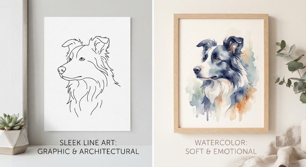
Choose Sleek Line Art if you want something graphic, architectural, and timeless — a portrait that reads almost like a logo or a piece of modern illustration. Choose Watercolor if you want something soft, emotional, and painterly — a portrait that feels more like a memory than a drawing.
Both are minimalist. Neither is plain. Here’s the full breakdown.
Visual Style: Lines vs. Light
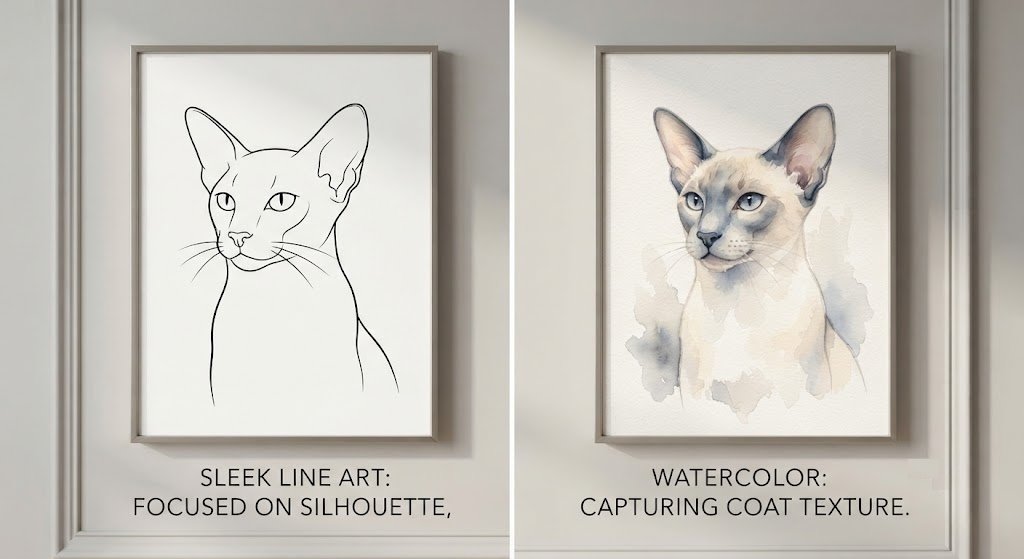
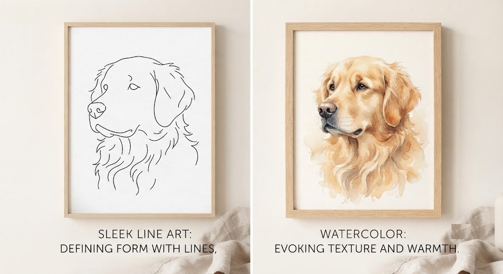
Sleek Line Art strips your pet down to essential form — clean, confident lines that define shape, expression, and silhouette with almost nothing extra. Think of it as the difference between describing someone in one precise sentence versus a full paragraph. There’s no shading gradient, no soft blending — just deliberate, graphic linework, available in classic black and white or with a single accent color.
Watercolor does the opposite. Instead of defining your pet with hard edges, it builds them out of soft color washes that bleed gently into one another. Backgrounds are often loosely suggested rather than fully rendered, and the overall effect feels translucent — like light passing through something rather than a solid object on a page.
If Sleek Line Art is a confident signature, Watercolor is a soft exhale.
Emotional Tone
This is where the real difference lives, and it’s worth sitting with.
Sleek Line Art feels composed and architectural. It doesn’t ask much of your emotions — it asks for your appreciation of form, of precision, of a well-made object. It’s the style of someone who values restraint and doesn’t need their home to “feel” a certain way so much as look a certain way.
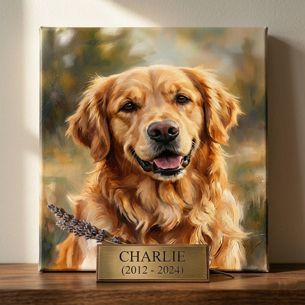
Watercolor feels tender. There’s an inherent softness to the medium that makes it the most commonly chosen style for sentimental pieces — memorial portraits, gifts marking an emotional milestone, art meant to evoke a feeling rather than just document an appearance. If you want your portrait to feel like a warm memory rather than a graphic statement, watercolor gets you there.
Neither is “more meaningful” than the other. They’re just doing different emotional work.
Which Pets Suit Each Style
Sleek Line Art rewards strong silhouettes. Greyhounds, Siamese cats, Border Collies, horses — animals with clearly defined features and confident posture translate beautifully into clean linework. The style does a remarkable job of capturing a pet’s shape — the exact curve of their ears, the line of their back — even without color or shading to fill in the details.
Watercolor rewards texture and softness. Long-haired cats, fluffy dogs, animals with expressive, soulful eyes — these subjects benefit from watercolor’s ability to suggest fur texture and emotional depth through color blending rather than hard outlines. A Golden Retriever’s fur, a Persian cat’s coat — watercolor handles these beautifully in a way line art intentionally doesn’t try to.
That said — this isn’t a hard rule. A sleek, short-haired cat can look stunning in watercolor’s soft palette, and a fluffy dog can look striking reduced to clean lines. Use this as a starting point, not a restriction.
Room and Home Style Fit
| Factor | Sleek Line Art | Watercolor |
|---|---|---|
| Best home style | Minimalist, Japandi, modern, industrial | Bohemian, Scandinavian, coastal, cottagecore |
| Best room | Office, gallery wall, modern living room | Bedroom, nursery, reading nook |
| Color palette | Black/white, optional single accent | Soft pastels — pinks, sages, blues, ivory |
| Visual weight | Light but graphic — draws the eye precisely | Light and airy — fills space gently |
| Pairs well with | Metal frames, white walls, bold typography decor | Natural wood frames, plants, soft textiles |
Which One Suits You
Beyond the pet and the room, there’s a simpler way to think about this: which one sounds more like you?
You might lean Sleek Line Art if:
- You describe your taste as “clean,” “modern,” or “minimal”
- You’d rather have one striking, precise piece than something soft and atmospheric
- Your home already leans toward black, white, and natural materials
- You want something that reads as design as much as portrait
You might lean Watercolor if:
- You want the portrait to feel emotionally warm, not just visually clean
- You’re choosing this as a sentimental gift or a memorial piece
- Your home has a softer, more layered aesthetic — plants, textiles, warm light
- You want something that feels like a gentle memory rather than a graphic statement
Can You Get Both?
Genuinely — yes, and a lot of people do. The two styles are different enough that they don’t compete with each other on the same wall; if anything, they complement each other. A Sleek Line Art portrait in a home office and a Watercolor portrait in the bedroom is a combination several of our customers have chosen specifically because the two styles serve such different emotional purposes.
If you have multiple pets, this is also a clever way to differentiate them — a confident, expressive dog rendered in bold linework, paired with a quieter, gentler cat in soft watercolor tones.
How It Works
Whichever style you land on, the process is identical:
- Upload your pet’s photo. A clear, well-lit shot with good detail gives both styles the most to work with.
- We send a digital preview within 2–3 days. Free, unlimited revisions until it’s exactly right.
- Once approved, we print on premium, museum-grade canvas, frameless and ready to hang, and ship it to your door.
Pricing (Same for Both Styles)
| Size | Original Price | Today’s Price |
|---|---|---|
| 8″ x 10″ | $79.95 | $49.95 |
| 12″ x 16″ | $119.95 | $69.95 |
| 16″ x 20″ | $149.95 | $89.95 |
Free worldwide shipping on orders over $50.
Still Torn?
That’s completely normal — these two styles were designed to sit at opposite ends of the same minimalist spirit, which is exactly why they’re both so popular. If you’re still unsure, send us your pet’s photo and tell us a little about the room it’s going in. We’re happy to recommend a direction.
Want to see the louder end of the spectrum too? Check out Royal Classic and Football Star for something bolder.
Not sure which style fits your specific pet? Send us their photo — we’ll tell you honestly which one we think will look best.